REIMAGINING INTERNAL TOOLS FOR MOODY'S RATINGS
OVERVIEW —
While working at Deloitte Digital, I was assigned to multiple projects focused on internal tools for fintech companies. The first project involved assessing Moody's intranet and developing a proposed design. This case study highlights the opportunities and areas for improvement we identified, along with my role within the team.
TEAM SIZE —
UX Designer, Project Manager, Project Lead, Partner, Consultant
The intranet at Moody's faced significant inefficiencies and usability challenges that were impacting collaboration, resource access, and communication across teams. As the sole UX Designer on the project, I collaborated closely with a team of consultants to conduct a thorough analysis of the platform. We identified key pain points, such as a cluttered interface and confusing navigation, which were hindering users' ability to efficiently access important resources and communicate effectively. By reorganizing the platform's structure, streamlining workflows, and implementing user-centered design principles, our goal was to create a more intuitive, user-friendly experience. This redesign aimed to not only improve the overall functionality of the intranet but also enhance productivity and communication across teams, fostering a more connected and efficient work environment.
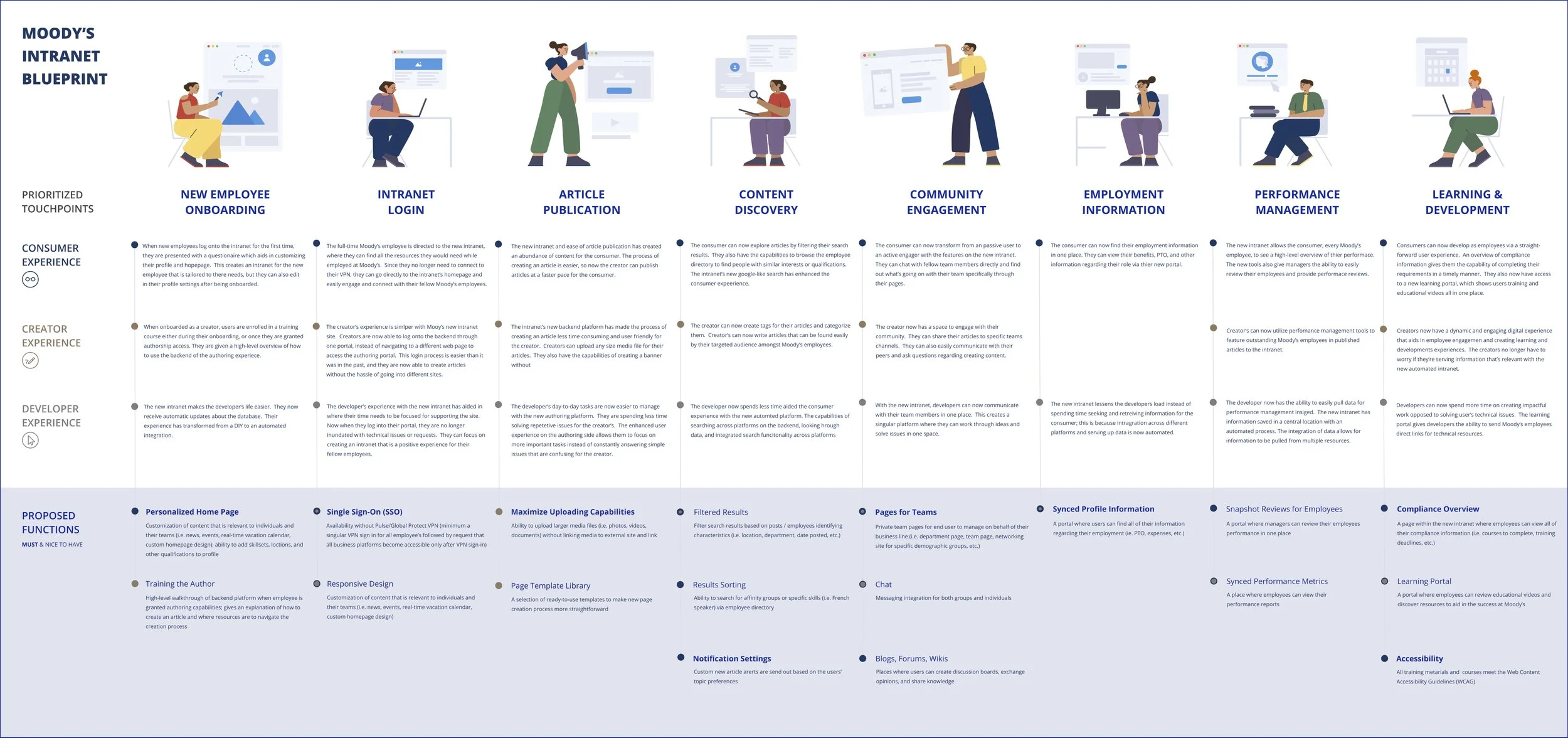
Service Blueprint.
A service blueprint was developed after conducting thorough interviews to understand the journeys of various users. Insights gathered from these interviews informed the design of proposed solutions.